So far in the creation process, we’ve checked off the planning, shooting and post-production stages off the list. In this post, we will explore how to integrate your virtual tour into your site and how to make it accessible to people with varying needs.
Site build
Now that the production process has been completed, you have a collection of content for your virtual tour that’s ready to be rolled out to your audience. You’ve invested all this work and time into your project, so it goes without saying that you want to get as many views as possible. Planning the site design and the grouping of content will help you drive higher engagement with your audience and influence viewers to explore the content in your virtual tour. Below we’ve outlined three things to consider to help you structure your site and showcase your virtual tour.

Format
Think about how you want your virtual tour to appear on your site. Do you want it to function on an existing page or have it displayed as a full width media presentation? From our past experience we recommend a full screen takeover, especially when it comes to accessing the virtual tour on mobile. You have high quality assets and 360° content, so working it into an existing page may hinder the usability of the tour and the overall user experience due to the limitations of existing layouts.
Content Organization
How should you organize the content on your website when you embed your virtual tour?

- Prioritize content for audience needs: find out what your audience values and what you want to show them. Using college as an example, one of your site’s main uses would be to attract students to attend your school. In this case, it would make sense to place the virtual tour on the pages that prospects visit when they’re doing their research. This will give students the opportunity to learn more about your school and explore what you have to offer to them.
- Include relevant and noticeable calls to action: think about what you want your audience to take away. Do you want your tour to drive an in-person visit? Do you want viewers to contact someone at your facility? Do you want them to buy into something? You want to make sure you’re creating a valuable and memorable experience for them so that they’re attracted to both your organization and the services you provide.
- Offer different paths to users: it’s a good idea to look at grouping your content into different sections to cater to different user groups. Using our college example, the different user groups looking at your webpage would be students applying directly from high school, non-direct students and international students. These three groups of personas have different interests and different profiles, so the content you would prioritize for one may line up differently for another. Using this strategy to configure your site build will help create the most captivating and relevant experience for your users.
User Interface

When considering the user interface for your site, you can decide to develop a custom solution from scratch or choose to work with a turnkey solution like Circuit, a purpose-built platform for managing and deploying immersive experiences. Regardless of your choice, here are some criteria that your user interface should meet:
- Easy to change: your site will be constantly adjusting as your venue changes. Pick a solution that is flexible and simple to accommodate new imagery and new stories.
- Accessible: is your site receptive to your users and their needs? Make sure you present your content in a way that is user-friendly and takes into account the needs of all users. Standards, such as WCAG 2.0 Level AA, are in place and provide strict requirements around user interfaces and experiences. We will dive deeper into this concept later in this post.
- Analytics: tracking engagement, views, clicks and conversions will provide valuable insights into what is working. As discussed in part one, tracking key metrics through a properly implemented analytics set up will help inform you of next steps to take for feature and content development.
- Responsive: how quickly and efficiently can your site respond to a user’s command? If your site isn’t able to complete a task in a reasonable timeframe, users will become frustrated and likely close your page. The responsiveness of your site and the experiences you’re building into it is a key factor in influencing how much time users spend on it.
Generally, it’s important to take format, content organization and the user interface into consideration when building your site around your virtual tour because it can heavily affect the overall user experience. For more details on how this affects the way your audience views your project, read our post on the lessons we’ve learned from launching hundreds of virtual tours.
Making your content accessible
It’s important to build digital experiences that meet people where they are. Your audience may include individuals with different types of abilities relating to vision, hearing and cognitive function. Making your virtual tour accessible to people with diverse abilities will not only help you reach a greater audience, it will also improve your search results and express your corporate social responsibility. Here are three ways you can make your content accessible:

1) Communicate your content in multiple ways
By presenting your content in different formats, it allows users to select how they want to see the information being presented. For example, you can provide subtitles for a video so viewers can follow what’s happening even with the absence of an audio element. For an image, you can provide a brief explanation to give some context to the photo (for more ways on how you can make your virtual tour and webpage more user-friendly, explore Wuhcag’s checklist on web accessibility).

Multiple types of browsing such as assistive devices, colour modes and different types of input devices should also be considered. Doing this ensures that if users aren’t able to interpret the information in one format there’s an alternative to view the material.
2) Make your virtual tour and webpage easy to navigate
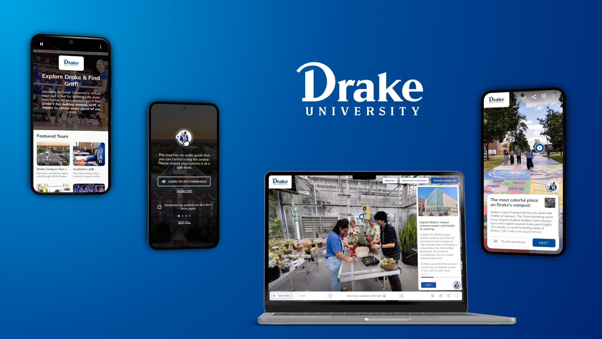
A general rule of thumb is to never overload your virtual tour or the webpage it lives on with too much information. We found that this often leads to a confusing and frustrating experience for users. A good design is one that’s easy to comprehend. Another suggestion is to have a coherent structure in your virtual tour. It should be clear what users are looking at in a scene, where they are in the tour and where they’re going next. With Circuit, we include a guide card in every location to describe to viewers what they’re looking at and the special features in that particular scene. We also have a tour menu so viewers are aware of where they are in the tour and what locations are next.


In Ontario, the WCAG 2.0 Level A and Level AA standards are technical requirements mandated by the Accessibilities for Ontarians with Disabilities Act. These standards outline elements such as incorporating keyboard accessibility and colour contrast to make your content more accessible. Even though these standards are specifically for organizations in Ontario, many jurisdictions in North America enforce similar standards for public institutions.
3) Make use of the accessibility features on social media
Many social media platforms now have accessibility features that can be applied to your content. For example, on YouTube you can choose to add closed captions to videos. On Twitter, users can pair images with text in their tweet to convey information in two different ways. On Facebook, many people accompany their photos with text, with some even putting text on the photo or video they’re posting to provide context. Keeping these accessibility strategies in mind will be beneficial when it comes to promoting your virtual tour on social media. We will go further into content promotion in the next section of this guide.
To create more inclusive experiences for your audience, we compiled a short list of tools you can use to check for user accessibility.
- Color Safe: gives you colour suggestions to match your theme while making your site accessible to a diverse crowd of users.
- WAVE: points out areas on a live website that can be made more accessible.
- Color Oracle: applies filters on your webpage that simulates different stages of colour vision impairments to test how accessible your background, text and image colours are.
- Color Contrast Checker: checks if font colours against their background colours pass the WCAG AA and AAA standards for accessibility.
Running these types of tools are just a small part to increasing content accessibility, but taking these extra steps will go a long way in helping you meet accessibility standards and engage a wider audience.
In the last part of our guide, we will talk about how you can reach your audience with your tour and how to promote your content.